Beware of the "Docu-prompter"
The Docu-Prompter
Every medium has a purpose.
A document has a purpose.
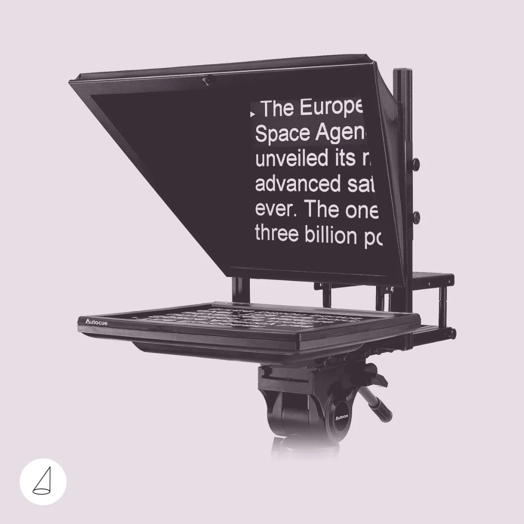
A teleprompter has a purpose.
A slide deck has a purpose.
The problem is that most presentations confuse all three.
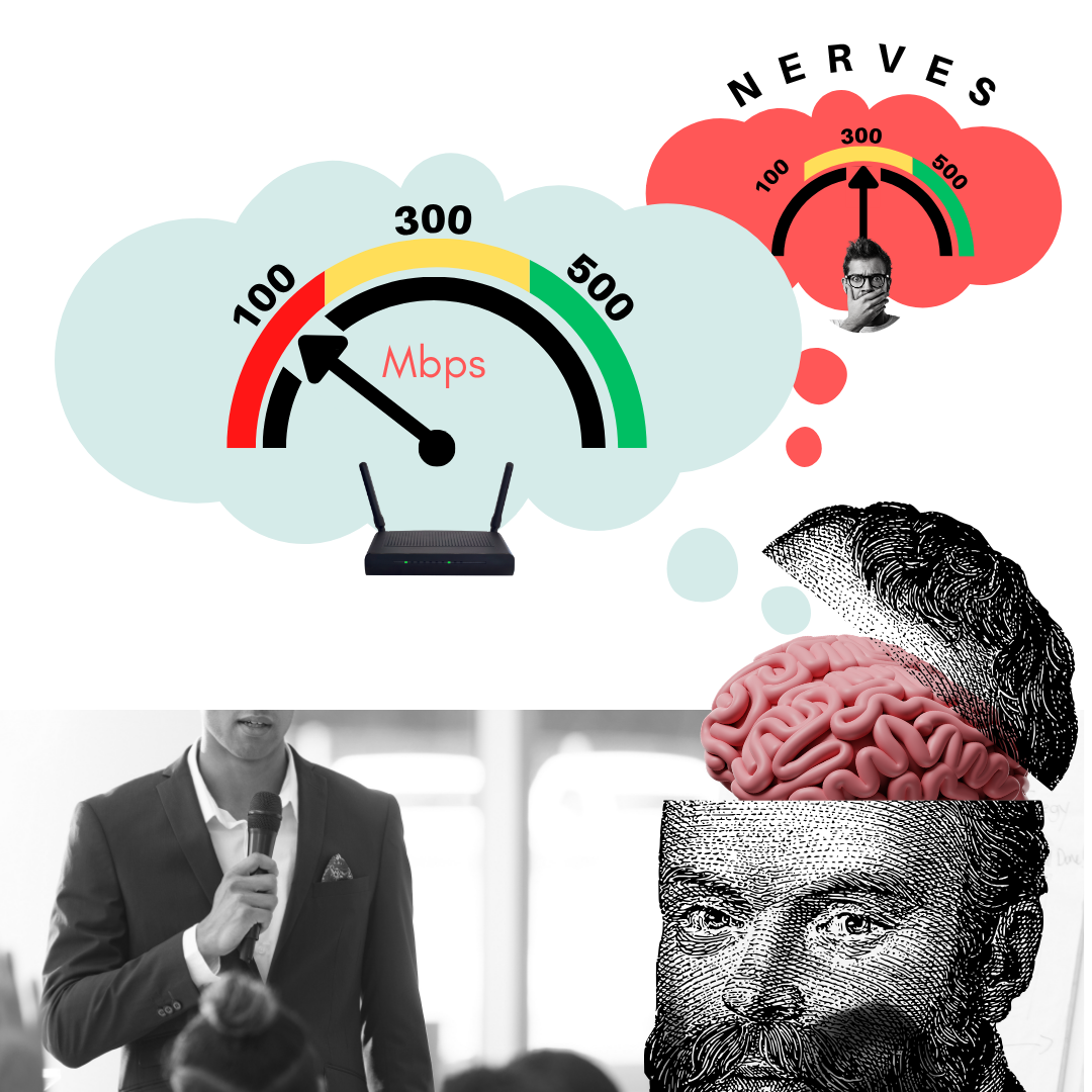
When a document and a teleprompter have a baby…
I call it the Docu-Prompter.
It’s what happens when someone projects a document onto a screen and then uses it as a script.
The audience sees paragraphs, bullet points, tables and tiny text.
The presenter turns around, reads the slide, or glances back at it every few seconds to remember what comes next.
Nobody wins.
A document belongs on a desk.
It’s something you read before a meeting, annotate with a pen, print, staple, email or keep as a reference afterwards. Documents are designed to be read.
A teleprompter belongs in front of a camera.
If you’re the President addressing the United Nations and every word matters, then by all means use one. That’s exactly what teleprompters are for.
But neither of these belongs on your presentation screen.
A slide deck is a completely different medium.
Its job is not to help you remember what to say.
Its job is not to replace the document that should have been sent before the meeting.
Its job is to support the spoken message.
The presentation is you.
The slides are simply there to help your audience follow, understand and remember what you’re saying.
They are the supporting cast, not the main character.
(Insert examples of Docu-Prompter slides here.)
Three simple design principles
Over the years I’ve found that almost every presentation becomes clearer by following three surprisingly simple rules.
1. One idea. One slide.
Every slide should communicate a single idea.
If your slide contains three different messages, you’ve already made your audience work harder than necessary.
People sometimes object:
“But then I’ll have far too many slides!”
So what?
Slides are not pages.
Nobody is printing them.
A presentation with sixty clear slides is almost always easier to follow than one with fifteen overcrowded ones.
One idea.
One slide.
2. Use very few objects
Resist the temptation to fill the canvas.
A great slide often contains only one or two visual elements.
Perhaps a photograph.
Perhaps an icon and a keyword.
Perhaps a simple diagram.
The fewer competing elements you place on the screen, the faster your audience understands what matters.
Visual simplicity creates mental clarity.
3. No text
This is usually the hardest rule for people to accept.
There should be no sentences on your slides.
None.
A title.
A keyword.
A date.
A number.
A quote, occasionally.
That’s about it.
The moment your slide contains paragraphs or bullet lists, your audience is forced to make a choice.
Should they read?
Or should they listen?
They can’t do both effectively.
Your voice carries the story.
The slide simply gives it a visual anchor.
Let the speaker do the speaking
The irony is that presenters often overload their slides because they fear forgetting what they wanted to say.
In reality, overloaded slides make presentations worse for everyone.
They tempt you to read.
They distract your audience.
They weaken your eye contact.
They reduce your spontaneity.
A great presentation isn’t a document projected onto a wall.
It’s a conversation supported by carefully chosen visuals.
When your slides stop trying to do your job…
…you become free to do it yourself.